Time series forecasting with Tableau
I am an Industrial Engineer utilizing the power of python to gain deeper insights in data.
I am currently learning Deep learning with TensorFlow
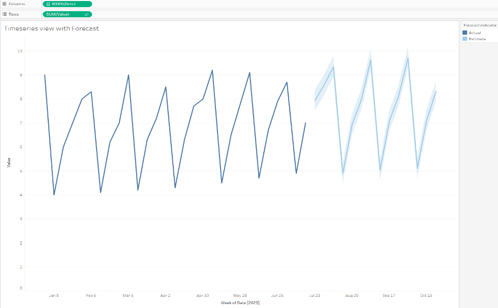
In another example I looked at performing time series forecasting in excel. I like examining different tools or methods to perform similar tasks. For this example I am performing forecasting within Tableau using the same dataset.
This method is also pretty straightforward.
Steps
Load the data into tableau. For this example I loaded an excel sheet with the mock data used in the excel example.
Create a line graph with a date value on the x axis.

On the left hand panel, select the 'Analytics' panel. Under 'Model', select 'Forecast' and drag it on the line chart. You will see a small pop up showing that it will add a forecast.

The chart will update and add the forecast. Here it is the light blue line with the shaded confidence interval band.

You can view and change settings by right-clicking on the line chart.
You can change the forecast timeframe, model, and confidence interval.

There is also an option to view descriptive information about the model.

Overall, I found this very quick to produce. Compared to the excel visual, tableau produced what looks like a smaller confidence interval band around the forecast. Excel automatically created a table with the forecasted values. While this can be created and exported by creating another sheet in tableau, it wasn't created automatically for me. Tableau is more of a visual presentation tool so this not is a surprise, but helpful to know before getting started with one method.
