Visualizing text data
Visualizing keywords in text dataset
I am an Industrial Engineer utilizing the power of python to gain deeper insights in data.
I am currently learning Deep learning with TensorFlow
As part of exploring the Kaggle dataset of tweets used to train and predict whether a tweet was about a real disaster or not, I explored a couple ways of visualizing the text data.
Python Bar Chart
Part of the dataset is a column for the tweet keyword. I created a sorted bar chart to display top keywords. 'Fatalities' is the top keyword by count with a number words very close.
# Plot tweet keywords
plt.bar(keyword_df['keyword'].head(20), keyword_df['count'].head(20), color='green')
plt.xticks(rotation = 90)
plt.ylabel('Count')
plt.title('Top keywords')
plt.show()

Python WordCloud
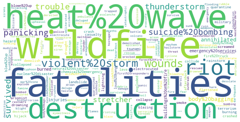
In python, I created a world cloud of the keywords.
# Create word cloud visual of keywords
from wordcloud import WordCloud
word_frequencies = keyword_df['keyword'].value_counts().to_dict()

# Generate the word cloud with frequencies
wordcloud = WordCloud(width=800, height=400, background_color='white')
wordcloud.generate_from_frequencies(word_frequencies)

# Display the word cloud using matplotlib
plt.figure(figsize=(10, 5))
plt.imshow(wordcloud, interpolation='bilinear')
plt.axis('off')
plt.show()

This created a neat visual where larger words are based on the count of keywords.
Tableau Word Cloud and TreeMap
Finally, I explored visualizing in Tableau, but since the top keywords have counts very close together, the word cloud looked more like a list of words.

I followed this video in creating the visual.
Changing the tableau chart into a TreeMap helped visualize a little better but it isn't as helpful as I would like.

You can view the Kaggle notebook where the python charts are used in a NLP classification model.
