Enhancing Control Charts with Anomaly Detection
I am an Industrial Engineer utilizing the power of python to gain deeper insights in data.
I am currently learning Deep learning with TensorFlow
Enhancing Control Charts
Control charts have always been one of my go-to tools for monitoring process stability. They offer a clear visual representation of how a process behaves over time. In this analysis, I wanted to take things a step further by incorporating anomaly detection, specifically using Isolation Forest.
In the past I have also used the control chart as part of visualizing data while performing hypothesis testing. I have updated a previous script I have been using, updating the control chart to include anomaly detection.
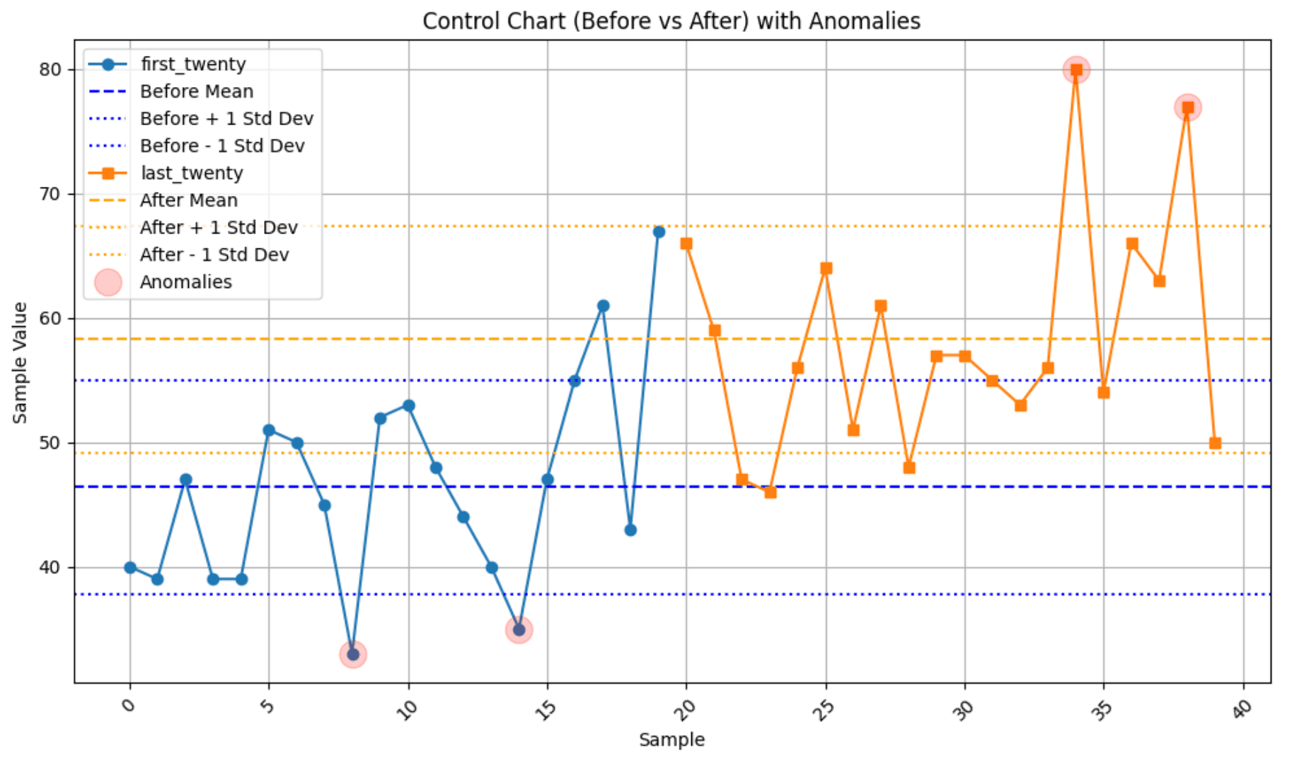
My Initial Control Chart: Before vs After
To start, I created a control chart to visualize two data sets—one representing the "before" phase and the other the "after" phase. The chart plots sample values over time, including key statistical indicators:
Mean Line: Represents the average value of each phase.
Standard Deviation Boundaries: Upper and lower bounds, marking one standard deviation from the mean.

This visualization helped me detect shifts in process performance. By comparing the "before" and "after" distributions, I could easily spot any significant changes in the mean or spread of data, indicating possible process improvements or deviations.
I do want to note that although control charts are typically used to check if a process is in control, there is information from the chart that can be beneficial to hypothesis testing. It can help visualize and highlight the different means or help assess the stability of the data.
Bringing in Anomaly Detection
To take my analysis further, I applied the Isolation Forest algorithm for anomaly detection. This method is great for identifying outliers because it isolates anomalies in fewer steps than normal data points. Here’s how I went about it:
Model Training: I trained the algorithm using sample scores, setting a contamination rate of 10%.
Anomaly Identification: The model flagged specific data points as anomalies, which I then plotted distinctly.
 #Anomaly detection
 isolation_method = IsolationForest(n_estimators=100, contamination=0.10)
 # Model fitting
 isolation_method.fit(pd.DataFrame(df['Scores']))
 df['anomaly_iso'] = isolation_method.predict(pd.DataFrame(df['Scores']))
 a = df.loc[df['anomaly_iso'] == -1, ['index', 'Scores']]  # Anomaly

What I Learned from the Updated Chart
After applying anomaly detection, the second control chart gave me some fresh insights:
Highlighted Anomalies: Points identified as anomalies were marked in red, making it easy to spot unusual deviations. This also aligned with outliers above and below the standard deviation.
Enhanced Process Understanding: These anomalies could indicate process breakdowns, measurement errors, or unexpected variations that needed further investigation.
Better Decision-Making: Seeing anomalies in real time allowed me to take proactive measures to maintain process stability.
Adding anomaly detection to control charts has been a game-changer for me. It provides an extra layer of insight that traditional control charts alone might miss. By combining classical statistical tools with modern machine learning techniques, I feel more confident in my ability to monitor processes effectively and drive continuous improvement.
This experience reinforced my belief that data-driven decision-making is key to maintaining operational efficiency, and I’ll definitely be using this approach in future analyses.